User Study: A11yFirst Plugin for CKEditor
1) Anonymize User
My user will be called “M.”
2) Background of User
My user is a middle aged woman who occasionally uses text editors like MS Word and other WYSIWYGs, but has no experience with CMS plugins or HTML. She is a great candidate to test A11yFirst, because she represents the “average” user who might be creating content for a website, but doesn’t possess intimate knowledge of how the CMS or the WYSIWYG operates.
3) Details of tasks, including the exact wording you gave to your user
The user test was completed using the following website: https://a11yfirst.library.illinois.edu/plugins-dev/custom/index.html
The questions were as follows:
1.) Please write up a few lines of your choice. It should include a title for the page and at least one paragraph. The paragraph should be titled.
2.) Please edit the look and feel of the document so that you're happy with the design
3.) Please add a photo to your webpage
4.) Can you please check the accessibility of the document?
4) What they did
Question 1.)
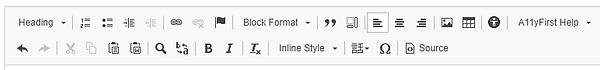
The very first thing that M. did was type a title for her hypothetical piece: “My Blog Post.” She then immediately said, “Why is it so big? Is the font supposed to be that big?” and attempted to edit the text size, but didn’t succeed. She clicked the “Heading” drop-down and said, “I don’t want heading, I want to change the font size,” and clicked out of the menu, leaving the text at its default size.
Next, M typed a two-sentence paragraph and a title to precede it. She attempted to make the title larger than the paragraph text, but once again gave up after briefly looking at the “Heading” drop-down menu. She clicked the drop-down and saw “Level 2” and said, “what is level 2? What do levels mean?” She didn’t click the “Level 2” button, and gave up on making her paragraph title larger than the text in the paragraph body.
Question 2.)
M hovered her cursor over each menu item, starting in the bottom right and moving left, taking note of the descriptive pop-ups that explain what each button does. She murmured, “Italics, Bold,” when hovering over those options, but didn’t seem to fully understand what each of the other controls did.
Having gone through all of the menu options, M clicked the “A11yFirst Help” drop-down, then selected the “Inline Style” option, expecting to find some information on text styling. She quickly skimmed through the “Inline Style” section, then each of the other help menu sections, then backed out and said, ““How do I change this? I don’t like any of these options.”
Question 3.)
I prefaced this question by instructing M to search for an image online. She navigated to Wikipedia’s Picture of the Day page and copied the URL for the image. In the A11yFirst editor, M quickly recognized the “insert image” icon and clicked it. She immediately looked at the “lorem ipsum” filler text in the image preview window and said “what is all this?” She then tried to highlight and delete the filler text, but gave up after realizing that it was not editable. Then she pasted her image URL in the appropriate field, briefly looked at the “Link” tab but didn’t interact with anything in it, then clicked “OK.”
Question 4.)
M began by hovering over each menu item, once again, starting from the bottom right and moving left. She then started hovering over each item in the top row, and clicked the accessibility icon after the descriptive pop-up informed her that it was the accessibility checker. The checker returned the message, “The document does not contain any accessibility issues.” M said, “It has no accessibility issues... is that it?”
5) What is interesting
I found it interesting that M instantly thought that the text size was too big. I have been toying with the editor for a while at the time of the user test, so I was used to the fact that the first text you type in the editor is a Heading 1 size. However, M reminded me that I had thought the same thing when I used the editor for the first time, because I was used to typing in an editor like MS Word, where the first text you type is paragraph-body size font. I expected M to struggle with Question 2, but I was surprised to see her instant reaction to typing in the editor.
6) What they didn't do
M never tested out the “Block Format” or “Inline Style” drop-down menus, which I expected her to explore during Question 2. Instead, she clicked the “Heading” drop-down, didn’t understand what “Levels” were, and gave up on styling altogether. It seems that, at least in this case, negative experiences for the user in a UX-testing experience can discourage exploration of other, possibly helpful features.
7) What was surprising to you
I was surprised at the ease with which M inserted an image into her document. For a user with little experience writing in web editors, it was surprising that she quickly and easily inserted an image. However, it is important to note that M began to explore the other tabs in the “Image Properties” tab but quickly gave up after looking at the “Link” tab and not understanding what it meant.
8) Candidate reasons why you think they did and didn't do certain things it
I think that M never clicked “Level 2” in the header drop-down because she didn’t know what HTML levels were. With no knowledge of what “Level 2” signifies, or what it will do to her document when she clicks, it, M chose to play it safe and keep her document the way it was. This could classify as a consistency error, as M is used to most text editors, where font size is editable via a numbered font size drop-down menu.
9) Relation to the readings
This user study showed me the importance of one of the first usability concepts we read about: consistency. A11yFirst sometimes does a good job of providing consistency, but other times it does not. It succeeds in that it allows users to add images and change some styling options (italics, bold) in a familiar or convenient way, but it fails by presenting unfamiliar options (accessibility checker, inline style, block format) in the menu bar without sufficiently explaining them.
10) Redesign Speculations
Issues that need addressing:
When entering the first lines of text, a pop-up or some other notification should draw users to the fact that this is an accessibility-focused text editor. The pop-up could say “Wondering why your text is so big?” or, “Looking for font size?” and direct the user to the appropriate help section. There are a lot of different ways to address this issue, and I’m looking forward to discussing it with my group.
The HTML language needs to either be removed or explained in the menu. I saw this cause the most trouble with “Level 2,” but there are a lot of HTML-specific terms in the menu (and drop-down menus) that may not make sense to the “average” user.
Make the, “document does not contain any accessibility issues” message more satisfying. The plain-text popup does not immediately signal that the user has done anything good, and doesn’t reward them for correctly using the editor to make an accessible web document. Some brighter colors, or a more informal tone could easily alleviate this issue.