
Initial Re-design Ideas
As part of our overall redesign, we've come up with the following potential additions or solutions to some of the problems that were addressed through our study.
Mark
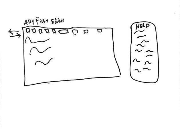
Our first idea was simply to add a menu to the side that would help users along as they create. This mitigates the issue of not knowing something is broken until the end as well as being fairly unobtrusive.
We also recommend tab functionality for the menu icons as indicated by the arrows on the left - we're unsure if this would be difficult are confusing and are noting to discuss this with our client later.

Next, we added on to that idea by providing an introduction to what the A11yFirst editor's purpose was below the title of the plugin. Depending on the CMS this is plugged in to, it may or may not show up, though we'd argue it should.
We also added further guidelines (See WCAG x.x.xx) to help users, and a "Check Accessibility" button to the bottom to fit into visual flow.
Lizzy

Our next design incorporated spell and grammar check. Though this may be handled by the user agent, it's important to include.
Additionally, we added some context to what the different headings are most generally used for. This allows novice users some idea of what headings/levels are and how they make semantic markup easier - again with minimal effort needed to go in to help documentation.
We also changed layout of the text controls to be more consistent with Word and other online editors by grouping basic formatting and editing options, as well as placing more advanced options on the bottom row.
Notably we switched the following:
-
Replaced the magnifying glass for "find and replace" with binoculars, to avoid confusion even we had by mistaking it for "search."
-
Replaced the languages icon with an A/あ icon, allowing consistency with Word and Google icons.
-
Replaced "View Source" with "View HTML" to maintain consistency with other online editors we tested, notably WordPress and Wix.

The next element addresses the checker that comes up when someone clicks "Check Accessibility." Our notable change is switching "No accessibility errors found." to "Congrats! You have no errors!" Some testers reported confusion in whether or not they did the right thing and responded negatively to the deadpan "No errors found." As such, we want to instead reward users for a job well done on creating accessible content.
We also recommend moving the Quick Fix button to the right vs. the left, as OK/Confirm buttons are nearly always on the right and we'd want to encourage users to allow the editor to fix things instead of skipping them. The one place that might remain the same is the alt-text error, as alt-text isn't always needed. For now, we recommend changing the entire dialog.
Nirvik

Our next idea tackles things a little different. It follows much of the same pattern as before, as we were working on these concurrently. This design, notably, changes the "Check Accessibility" icon to a button but maintains its location.
This design also makes use of the help menu to the side, witht he addition of being sure to include close buttons to allow the expert user to hide the windows and add more editor space, if that's something they wish to do so.
Further, this design tackles the issue of image uploading. We've adjusted the upload dialog to include an alt-text input to mitigate remediation and allow users to build it in instead. It also takes into account the issue of placeholder text. The existing "Lorem Ipsum" text in there was confusing to some of our users, and we've opted to make it something that will disappear once the user focuses the alt-text box. The placeholder text, instead of being simple Lorem Ipsum, could contain a brief overview of alt-text and its importance.
Joe

This version of our redesign covers many of the things addressed in the earlier sketches and is close to what our ultimate goal is.
It contains our description of what the different heading levels are and what they're for (most generally), sorts the formatting options to allow greater ease of understanding for a new user, leaves the advanced options on the bottom row, and swaps out some buttons and icons.
Of note is the removal of the "block formatting" and changing the "inline stlye" to say "text style" ionstead. This is due to our understanding (which may be wrong at this point) that those are similar to Adobe's "Paragraph Styles" and "Character Styles" options. We removed the block formatting to reduce some possible feature fatigue of our users in the beginning.
We also have present a different location for the accessibility checker, which was also mentioned above. We moved it to be more consistent with Wordpress' and Wix' Publish button locations, so as to encourage the user to follow the Save, Preview, Publish routine, and effortlessly add Check Accessibility to that routine.